History
Harmony of Golden Footprints: Looking at Half a Century of OPA DIAZ Malang
This language version was translated automatically and has not been reviewed by a human yet.
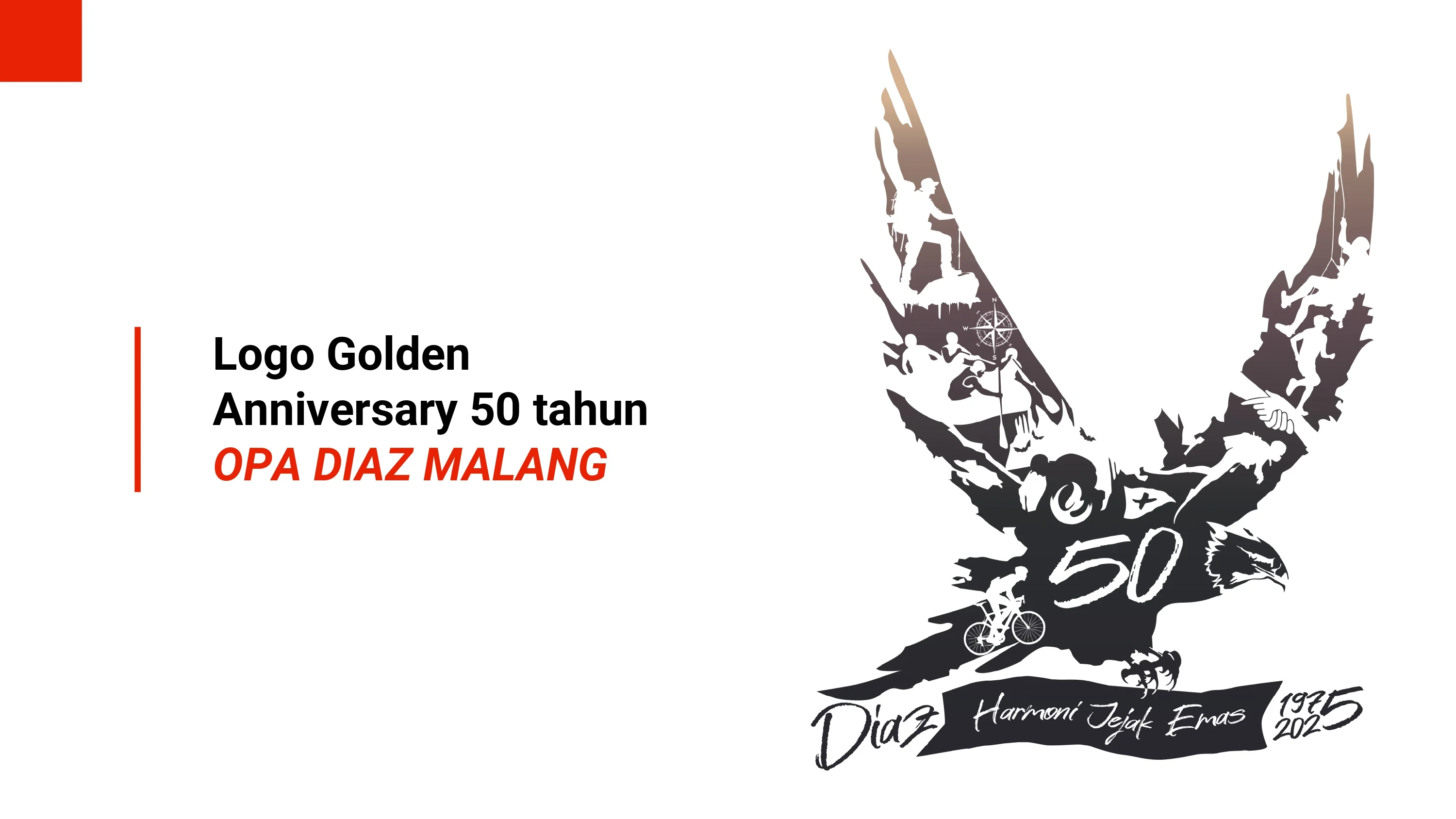
Commemoration of the 50th Golden Anniversary of OPA DIAZ Malang
Beneath the shelter of the forest and the crackle of a campfire breaking the silence of the night, a long journey is etched—one that began in 1975. Half a century has passed, weaving bonds of togetherness and steadfastness across the vast expanse of the Indonesian archipelago. The Golden Anniversary celebration of the 50th year of OPA DIAZ Malang stands as a stage of honor for the dedication, courage, and spirit of adventure that has never dimmed.
The Symbolism of the Eagle and the Silhouette of Adventure
This logo takes the majestic form of an Eagle in flight, its wings spread wide. The Eagle embodies the organization's sharp vision, calm in facing challenges, and absolute freedom in viewing the world from great heights.
Employing the visual principle of Gestalt, the Eagle's wings and body are arranged artistically from a series of silhouettes representing 11 main activities of the organization:
Steps of Resilience: Mountaineering, Caving, Climbing, and Running.
Currents and Depths: Rafting, Canyoning, and Diving.
Orientation and Endurance: Orienteering, Navigation, Survival, and First Aid.
Dedication of Spirit: Conservation, Social Participation, and Search and Rescue (SAR).
Within the expanse of these activity silhouettes, the number 50 is inscribed—a monumental marker of the Golden Anniversary achievement spanning the journey from 1975 to 2025.
The Philosophy of the Theme "Harmony of Golden Footprints"
At the base of the logo, a ribbon unfolds bearing the main slogan: "Harmony of Golden Footprints". This phrase encapsulates three fundamental pillars of value:
Harmony: Diversity of activities, bonds of unity, and the sustainability of relationships across generations.
Footprints: Track record, actions, and all genuine dedication that has been etched in the open wilderness.
Golden: A symbol of the 50th year—an achievement of high value forged by time.
The Warmth of Color and Flexibility of Application
The colors employed use a gradient from dark brown to deep tones (#D4B291, #604D53, #2C2E30, #28272F). These earthy tones symbolize resilience, strength rooted in nature, reliability, safety, and the warmth of brotherhood that brings peace.
Visually, this identity is designed to be adaptable for various media—from identity boards, parade banners, t-shirts, stickers, to digital media. This logo ensures that the message of resilience and respect for nature stands firm, harmonious, and striking against every background.
Viva DIAZ